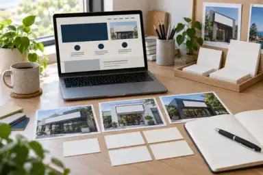

A customer may first meet a local business on a phone screen and next see it from the footpath. Those two encounters should make sense together. A recognisable name, familiar visual identity and clear visit information help the person understand that they have found the place they intended to visit.
Website design can support that transition without reproducing the shopfront on every page. The site has room to explain products, answer practical questions and prepare someone for a visit. The physical frontage has a shorter job: make the business identifiable in its setting and help people find the entrance.
When reviewing signage melbourne options alongside a website project, share the same current business details and approved brand references with both suppliers. Ask the web designer and sign supplier to explain where their formats need different treatment. That discussion is more useful than expecting a website screenshot to serve as a complete production brief.
Start with the facts a visitor needs
Write down the business name as it should appear publicly, the address, the preferred description of what you do and the current opening arrangements. Confirm those facts with the person who runs the premises. A polished design cannot make conflicting information easier to act on.
Consider the difference between the postal address and the way a customer actually enters. A shop in a larger building may have an entrance on another side, a different trading name above the door or a collection point inside. Explain the relevant details on the website in plain language, using accurate current photographs where appropriate.
Make a simple reference sheet for the project. Give each fact an owner and a review date, particularly if you are opening, moving or changing hours. The designer should know whether a piece of information is confirmed or still awaiting a decision.
Design a page that prepares someone to arrive
A location page can do more than display an address beneath a map. It can identify the premises, describe the entrance and explain what visitors should expect when they get there. Include only details that the business can confirm and maintain.
If appointments, collection or walk-in visits follow different arrangements, describe them clearly. Do not imply that every service is available at the same location or at every opening time. A visitor planning a quick collection needs different information from someone browsing products before a first visit.
Our guide to essential features for business websites covers the wider website plan. Within that plan, treat visiting information as content with a purpose, rather than something added to the footer once the main design is finished.
Use photographs that help people recognise the real place. A clear exterior view may be more useful on a location page than a decorative image of a similar shop. If the frontage changes during the project, arrange to replace the old photograph after the work is complete.
Use shared visual references with room to adapt
Keep the logo versions organised
Provide the approved logo family and explain which versions are intended for particular uses. The web designer may need a compact mark for a small screen, while a sign supplier needs suitable production artwork. Both should be able to identify the approved source rather than choosing between several files labelled “final”.
Scott M.'s May 2026 brand consistency guide at Roxbury Custom Vinyl discusses approved logo versions and the need to account for different production methods. A useful takeaway is to control the identity while allowing a suitable format for each medium.
When a supplier proposes a variation, ask what problem it solves and record the approved use. A compact logo for mobile navigation does not automatically become a replacement for the main business identity. Clear file names and a short note can prevent that misunderstanding later.
Review colour in its own setting
A screen, a printed graphic and a painted surface present colour differently. Give suppliers the agreed references and ask how they will check their proposed output. Do not make a phone photograph the only basis for approving a physical finish.
On the website, review colour alongside readable text, buttons and images. At the premises, review the proposed material or sample in the intended setting where practical. The aim is a coherent identity that works in each place, rather than a promise that every surface will appear identical in every light.
Connect the photography and tone
Choose website images that reflect the actual business and its current offer. If the physical space is quiet and straightforward, the site does not need to invent a dramatically different atmosphere. Equally, a colourful retail space can be represented without placing competing decorative elements around every heading.
Keep the wording recognisable too. Use the same plain description of the business across the main website pages and relevant customer-facing materials. Different pages can answer different questions while still sounding like the same organisation.
Make the website behave consistently
Visual familiarity includes the way pages work. A button that starts a booking should not look identical to a decorative label that does nothing. Navigation labels should remain understandable as visitors move from a product page to information about the premises.
The June 2026 website brand guide from LS25 Web Design treats consistency as a combination of design, language and user experience. That is a useful reminder to review the site's behaviour as well as its logo and colours.
If a booking or ordering process uses another provider, make the transition clear. Explain what the visitor is about to do and check the destination before launch. The business name and service information should remain understandable even where the interface changes.
Review confirmation messages as part of the design. A customer who submits an enquiry needs to know whether it arrived and what happens next. Use a response arrangement that the business can actually maintain, rather than copying an ambitious promise into every form.
Test the journey on a real phone
Start with a task that a customer might reasonably have, such as finding the entrance before an appointment. Open the relevant page on a phone and try to complete that task without relying on information you already know as the business owner.
Can you identify the right location? Can you read the visit information without zooming? Does the main action make sense at that point? A useful test is specific enough that someone can say where they hesitated, rather than simply rating the site as attractive.
Our mobile-first design guide discusses the wider mobile experience. For the website-to-shopfront journey, pay particular attention to the information someone may need while travelling or standing near the premises.
Andrei Casian's September 2026 customer journey guide for MonoWeb follows a person's needs across the points where they meet a business. For a shop, you can use a modest version of that exercise: choose one visit, list the questions it involves and identify which page answers each one.
Keep the review practical. You do not need to redesign the whole website because one person missed the opening hours. First establish whether the information is wrong, hard to find or presented at an unhelpful point in the journey.
Prepare a brief that both suppliers can use
The shared part of a web and signage brief includes the approved name, logo references, business description and current premises information. The separate parts should explain what each supplier is being asked to deliver. A homepage layout and a fascia elevation solve different design problems.
Give the web designer accurate photographs and explain planned changes to the shopfront. Give the sign supplier the appropriate site information through the people responsible for the physical project. Ask each supplier what additional inputs they need rather than assuming the other one has already provided them.
Our guide to working with local web designers is useful when organising that collaboration. Agree who can approve the website's visual direction and who confirms the business facts. Keep those responsibilities clear when several people provide feedback.
Record the approved versions and distribute changes deliberately. If the business name, opening date or logo changes, identify which website pages and physical materials are affected. A shared update note is easier to follow than separate conversations that reach different conclusions.
Plan the transition as well as the launch
A new website may go live before a new sign is installed, or the frontage may change while an older website is still public. Decide how customers will recognise the business during that period. If a temporary explanation is needed, make it accurate and remove it once the change is complete.
For a move, review the address wherever visitors are likely to encounter it on the site. Look beyond the location page to booking instructions, collection details and downloadable materials. Have the responsible person confirm the final information before it is published.
For a change in hours, decide who updates the website and which other business-owned materials need review. Do not rely on a designer remembering an operational change they were never told about. The update process should be simple enough to use when the business is busy.
Campaigns need an end point too. A window promotion and its related website page should remain understandable when the offer finishes. Remove or revise expired wording according to the agreed plan, and check that links still lead somewhere useful.
A fictional independent shop example
Imagine a small homewares shop whose website uses a shortened name, while the frontage displays its full trading name. The address is correct, but the entrance photograph shows an earlier tenant's sign. Customers sometimes call from outside to confirm they are in the right place.
The first improvement is to clarify the location page, confirm the naming approach and add a current exterior photograph. The web designer then uses the approved logo versions throughout the site. The sign supplier receives the same identity references for a planned frontage refresh, with its production decisions reviewed separately.
This example does not require a new booking system or a complex campaign. It starts with the questions a visitor is already asking. The visual identity and the visit information support each other, making the route from screen to doorway easier to understand.
Keep a small, useful review routine
Check the website after a significant change at the premises, such as a move, new entrance or altered collection arrangement. Use a short list of affected pages and ask the operational owner to confirm the details. Keep a dated record so the next person knows what was reviewed.
Customer questions can guide smaller improvements. If people repeatedly ask where to park, how to find the door or whether a service is available in store, review whether the website gives a clear, accurate answer. Confirm the facts before adding guidance, particularly where conditions can change.
Review the design references when new material is commissioned. Send suppliers the current files and explain any approved variations. A tidy source folder and a clear owner are often more useful than a long document that nobody consults.
Recognition should make the next step easier
A coherent website and shopfront give customers a familiar thread to follow, from the first page they open to the entrance they find. Accurate details, useful photographs and consistent design choices all contribute to that experience. The strongest result is a business that looks recognisable and gives people the information they need at the moment they need it.